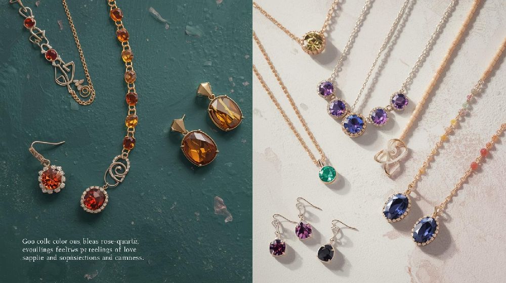
In the world of jewelry marketing, visuals speak louder than words. Before a customer reads a product description or checks the price, they respond emotionally to what they see. Among all visual elements, color plays the most powerful role. It shapes perception, influences mood, and drives purchasing decisions.
Color psychology—the study of how colors affect human behavior—is a strategic tool in jewelry marketing campaigns. From packaging and website design to social media ads and showroom displays, color influences how a brand is perceived and remembered.
Why Color Matters in Jewelry Marketing
Jewelry is an emotional purchase. Whether it symbolizes love, status, celebration, or self-expression, buyers are guided by feelings. Color directly impacts those feelings by:
-
Creating mood and atmosphere
-
Building brand identity
-
Influencing perceived value
-
Enhancing product appeal
-
Encouraging impulse buying
A well-designed campaign uses color intentionally, not randomly.
The Psychology Behind Popular Jewelry Colors
1. Gold – Luxury, Success, Prestige
Gold tones instantly communicate wealth, tradition, and timeless elegance. Marketing campaigns that use deep gold, champagne, or metallic hues evoke:
-
Premium quality
-
Heritage craftsmanship
-
Investment value
-
Royal appeal
This is why luxury jewelry brands often use black and gold combinations—they create contrast and elevate perceived exclusivity.
2. Silver – Modernity, Minimalism, Sophistication
Silver and grey tones are associated with innovation and contemporary style. Sterling silver campaigns often use:
-
Cool-toned backgrounds
-
Clean white layouts
-
Minimalist designs
These colors appeal to younger audiences and modern professionals seeking everyday elegance.
3. Red – Passion, Celebration, Power
Red triggers strong emotional responses. It is often used in:
-
Wedding jewelry campaigns
-
Festive promotions
-
Valentine’s collections
Red symbolizes love, strength, and cultural richness—especially in markets where it represents prosperity and tradition.
4. Blue – Trust, Stability, Authenticity
Blue is linked to reliability and transparency. Jewelry brands promoting:
-
Certified purity
-
Ethical sourcing
-
Secure online buying
often use blue tones to build consumer confidence.
5. Black – Exclusivity and Luxury
Black backgrounds make jewelry sparkle more dramatically. It enhances contrast and creates:
-
High-end appeal
-
Mystery
-
Power and authority
High-gloss gold or diamond jewelry displayed against black instantly feels premium.
6. Pink & Rose Tones – Romance and Femininity
Rose gold campaigns often use soft blush, nude, or pastel backgrounds to create warmth and emotional connection.
These tones appeal strongly in:
-
Bridal marketing
-
Anniversary collections
-
Fashion-forward pieces
How Background Colors Affect Perceived Value
Scientific studies show that darker backgrounds often increase perceived luxury. For example:
-
Black enhances brilliance of diamonds
-
Deep navy highlights white gold
-
Emerald green complements yellow gold
Light backgrounds, on the other hand, create a fresh and accessible feel—ideal for everyday or minimalist jewelry lines.
Emotional Triggers in Digital Campaigns
In digital marketing, color affects click-through rates and engagement. For example:
-
Warm colors (red, orange) create urgency
-
Cool tones (blue, grey) build trust
-
Metallic accents increase premium perception
Call-to-action buttons also benefit from color psychology. A bold contrasting color draws immediate attention.
Cultural Influence on Color Psychology
Color perception varies across cultures:
-
Red symbolizes luck and prosperity in many Asian markets.
-
White may symbolize purity in some cultures but mourning in others.
-
Gold is universally associated with wealth but may carry deeper traditional meaning in specific regions.
Jewelry brands targeting global markets must adapt their campaigns accordingly.
Packaging and Brand Identity
Color psychology extends beyond advertising. Packaging design significantly influences customer experience.
-
Gold-foil stamping enhances perceived luxury.
-
Matte black boxes signal exclusivity.
-
Soft pastel packaging appeals to younger demographics.
Consistent color branding builds recognition and emotional loyalty.
Social Media and Visual Storytelling
On platforms like Instagram and Pinterest, color consistency creates a recognizable aesthetic. Brands often:
-
Maintain a signature color palette
-
Use coordinated filters
-
Align product shoots with brand tones
This visual harmony increases brand recall and trust.
The Science Behind Light and Reflection
In jewelry photography, color interacts with lighting. Warm lighting enhances yellow gold, while cool lighting enhances silver and diamonds.
Professional campaigns carefully balance:
-
Background color
-
Light temperature
-
Reflective surfaces
-
Product tone
This scientific approach ensures jewelry looks vibrant and luxurious.
Strategic Color Pairings in Campaigns
Some of the most powerful combinations in jewelry marketing include:
-
Black + Gold → Luxury & Power
-
White + Silver → Purity & Modernity
-
Red + Gold → Celebration & Tradition
-
Navy + Diamond White → Trust & Premium Quality
-
Blush + Rose Gold → Romance & Elegance
Each pairing sends a specific emotional message.
The Future of Color Psychology in Jewelry Marketing
With AI-driven marketing tools and personalized advertising, brands can now analyze which colors perform best with specific audiences. Data-driven campaigns allow marketers to:
-
Test color variations
-
Track engagement metrics
-
Customize visuals for target demographics
Color is no longer just artistic—it is strategic and measurable.
Final Thoughts
Color psychology is a powerful scientific tool in jewelry marketing campaigns. It influences perception, builds emotional connection, enhances luxury appeal, and drives purchasing decisions.
In the competitive jewelry industry, success is not just about design—it’s about presentation. When brands understand how color shapes emotion and perception, they can craft campaigns that captivate, inspire, and convert.
In jewelry marketing, color is not decoration—it is communication.


